You’ve spent years perfecting your medical device website, but have not tried these design tweaks. You’ve navigated clinical trials, FDA approvals, and rigorous testing. But here’s the kicker: if your website isn’t optimized to connect with your audience, even groundbreaking innovation can go unnoticed. In the ultra-competitive medical device industry, your website isn’t just a digital brochure—it’s your most powerful conversion tool.
The problem? 75% of healthcare professionals judge a company’s credibility based on website design (Source: Stanford Medicine). A clunky, confusing, or untrustworthy site drives visitors away faster than a poorly calibrated scalpel. But don’t panic—I’ve spent over a decade refining medical device website design tweaks that turn skeptics into leads. Let’s dive into five actionable strategies to transform your site from stagnant to high-converting.
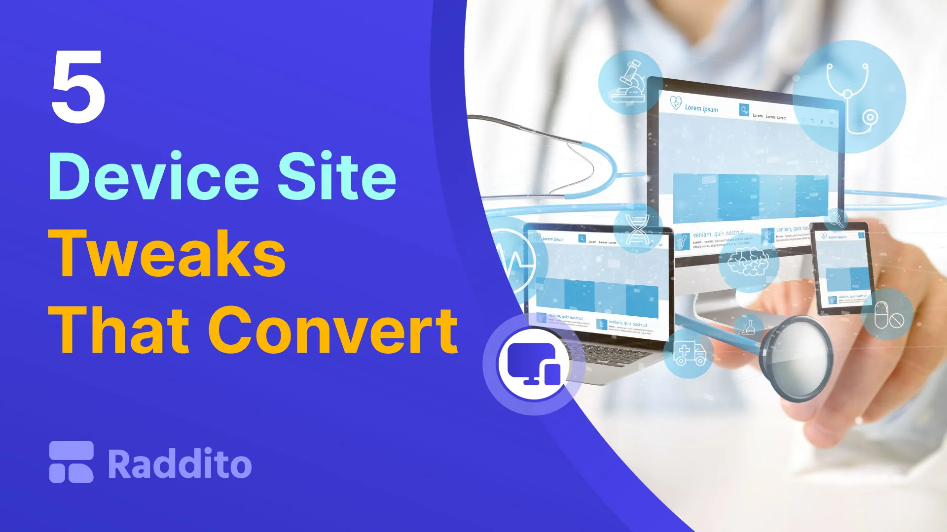
1. Prioritize Clarity and Trust in Medical Device Website Design Tweaks
Medical device buyers—whether clinicians, procurement teams, or hospital administrators—aren’t impulse shoppers. They need clear, concise information to justify high-stakes decisions. Yet, many websites bury key details under jargon-heavy paragraphs or flashy animations.
Fix it fast:
- Lead with patient outcomes, not specs. For example, instead of “1500 RPM motor,” say “Reduces procedure time by 30%.”
- Use trust badges like FDA approvals, ISO certifications, or HIPAA compliance seals above the fold.
- Replace stock photos with real-world visuals—clinicians using your device, patients benefiting from it, or lab environments.
Remember, trust is non-negotiable. A case study by MedTech Strategist found that websites with third-party validation converted 68% better than those without.
Struggling to balance technical details with simplicity? [Schedule time with our team] to audit your messaging.
2. Optimize for Mobile: A Non-Negotiable Medical Device Website Design Tweak
Here’s a harsh truth: 42% of healthcare professionals use mobile devices exclusively for initial research (AMA). If your site isn’t mobile-first, you’re alienating nearly half your audience before they even see your value.
Key adjustments:
- Test load speeds. Aim for under 3 seconds—every extra second increases bounce rates by 32%.
- Simplify forms. Use autofill-friendly fields and limit mandatory inputs.
- Design thumb-friendly navigation. Place CTAs and menus where fingers naturally tap.
Pro tip: Use heatmaps to identify “dead zones” on mobile pages. One client saw a 90% boost in demo requests after resizing unclickable buttons.
3. Streamline Navigation with Surgical Precision
Medical device websites often suffer from “feature overload”—dumping every product detail into a labyrinth of submenus. Confused visitors don’t convert.
Cut the clutter:
- Adopt a three-click rule: Users should reach critical pages (product specs, contact, clinical data) within three clicks.
- Use predictive search bars with filters like “by specialty” or “by regulatory status.”
- Create a “Resources Hub” for whitepapers, videos, and case studies—gate high-value content behind a short form to capture leads.
Example: A cardiovascular device company increased time-on-page by 140% by replacing a 12-item menu with a mega-menu sorted by surgical specialty.
Need help organizing complex product lines? [Live chat] with our UX experts today.
4. Leverage Persuasive CTAs Tailored to Medical Buyers
“Contact Us” is the vanilla ice cream of CTAs—safe but forgettable. Medical buyers need context-specific nudges that align with their decision-making stage.
High-converting CTAs for medical device websites:
- “Download the Clinical Trial Summary” (for evidence-driven users)
- “Schedule a Live Demo with Our Engineers” (for technical evaluators)
- “Get Reimbursement Guidelines” (for procurement teams)
Place CTAs strategically:
- Float a sticky header CTA during scroll.
- Add a post-video CTA after testimonials.
- Use contrasting colors—one client’s orange “See ROI Calculator” button outperformed blue by 200%.
5. Embed Social Proof That Speaks to Medical Stakeholders
Peer validation is everything in healthcare. Yet, most medical device websites waste prime real estate on vague testimonials like “Great product!”
Level up your social proof:
- Feature video testimonials from named clinicians (“Dr. Sarah Lin, Johns Hopkins Hospital”).
- Display logos of accredited hospitals using your device.
- Show real-time data (“Used in 1,200+ procedures this month”).
A neurodevice brand saw a 50% increase in inbound leads after adding a “Physician Case Study” section with downloadable PDFs.
Ready to Transform Your Medical Device Website?
These medical device website design tweaks aren’t theoretical—they’re battle-tested strategies I’ve used to help startups and renowned medtech firms alike 2X their conversion rates in under six months. But remember: even the best design fails without continuous testing.
Your next step: Audit one page of your site using these tweaks. Replace one generic CTA, simplify your navigation, or add a trust badge. Then measure the lift.
Still overwhelmed? You don’t have to DIY this. Contact us for a free, no-strings website scorecard tailored to medical devices. Or book a 30-minute consult to brainstorm how we can turn your site into a 24/7 sales engine.
Because in the end, your medical device deserves a website that works as hard as your team does.
P.S. Found one tip useful? Imagine what we could do with a full strategy. Hit the live chat—we’re here to help.